We've bought the Recent Comments Widget for wpDiscuz. It seems to be working well - good job.
I'm trying to do a little fine-tuning of the Look and Feel to match our site and it's great that you've thought how to make that as easy as possible.
We've settled on currently having the following tabs available to readers: Recent Comments, Most Commented Article and Most Voted Comments.
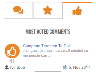
When comparing the layouts between them, it's really noticeable that the layout of the Most Commented Article and Most Voted Comments tabs are different to the Recent Comments tab. The first two are laid out the same: Headline a larger font size, Author at the bottom left and the Date on the bottom right. There's an icon on the left too.
Example
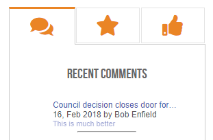
The Recent Comments tab is really different: Headline (smaller font) on top line; (Next line) Date by Commentor's name; (Third line) Start of comment. No icon showing.
Example
Getting them to look the same
For a consistent experience for readers, it seems to make sense for each of the tabs to have the same layout doesn't it? Otherwise switching between the tabs is quite jarring.
Is there a reason you've made Recent Comments tab look different to the others?
Can you show us how we can make the layout consistent/the same please.


