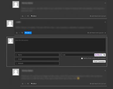
Firstly, thank you for such an awesome product! 😀 Makes commenting so much nicer to use 😀
secondly, can anyone help me style the "Post Comment" button to match my sites theme?
I've tweaked the look of some of the other parts of the plugin by using some cobbled together CSS, but cannot get the "Post Comment" button to look any different from the default ugly grey (see attached pic)
Is there any CSS I can use to manipulate it? maybe turn it blue(#0083fe) like the reply buttons?
Any help would be much appreciated 🙂
Thanks
I'm sorry but we don't provide custom css for button styling.
How did you solve this?
Never got this fully solved, but did manage to put together some custom CSS from various places and then tweaked it to get it close to what I wanted.
this is what I came up with:
#wpcomm button, #wpcomm input[type="button"], #wpcomm input[type="submit"]{
background-color: #0083fe; /* Blue */
border: none;
color: white;
padding: 16px 32px;
text-align: center;
text-decoration: none;
font-weight: bold;
display: inline-block;
font-size: 16px;
margin: 4px 2px;
}
So it colors and sizes the button, and places it where I'd like,
but there is no mouse over effect unfortunately :/
Other than that it does seem to work ok.

