Hello,
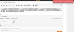
this concerns wpforo but also it's addon like the advanced comment addon: when I post a topic or an attachement, the loading indicator displays in top corner of screen. It's easy to miss out, so user might think nothing is happening after he sent his content.
Could I suggest to have this more in front of the center of screen?
Please follow the Astghik's answer in this support topic: https://gvectors.com/forum/wpdiscuz-comment-plugin-support/loading-indicator-z-index/#post-17780
Thanks, this works well for Wpdiscuz, but not for wpforo.
Anyway to bring all loading indicators and confirmation dialogs in middle of screen instead of far up right corner, for wpforo?
Sorry for the misunderstanding.
Please use the following one:
div#wpforo-load
top: 50% !important;
left: 30% !important;
}
The CSS code should be added in the Dashboard > Forums > Settings > Styles admin page "Custom CSS code" textarea.
Thanks, it's much better.
Do you have also something so I can have the confirmation in the middle of the screen?
I'm talking about the red and green dialogs that confirm or warn of a problem.
Do you have also something so I can have the confirmation in the middle of the screen?
I'm talking about the red and green dialogs that confirm or warn of a problem.
Please use the following CSS code:
#wpf-msg-box{
   top: 50% !important;
   left: 30% !important;
}
In any case please don't forget to delete all caches and press CTRL+F5(twice) on the frontend before checking.

