Hello,
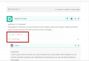
I noticed some bug/error in Discuz template and I don't if it's my site fault or general issue... Please see the attachment:
Also in iPad portrait view the date of the comment goes into next line and make the whole comment bigger. I think it would look better if it would stay in the same line - there is enough space for that.
I work on my website right now: https://4review.pl/
So you can see it there.
Also, I am not very good at coding but I would like to make my comments look more simpler like flat design. I would love my comments to look like on screenshot at main Discuz page: https://wpdiscuz.com/ please check the attachment:
Can anyone send my CSS styling of this template? So I could paste it into WP Discuz Settings CSS field. It would be great.
Thank you all for your help! 🙂
Dear @kiko91,
This is small conflict to your theme:
@media screen and (max-width: 420px)
#wpcomm .wpdiscuz-sort-buttons, #wpcomm .wpdiscuz-sort-button {
 padding-top: 1px;
 font-size: 8px!important;
}
This code will fix the following conflict. You need to put it in Dashboard > Comments > Settings > Styling admin page. Also, you can write your custom CSS codes and put them here.
Also in iPad portrait view the date of the comment goes into next line and make the whole comment bigger. I think it would look better if it would stay in the same line - there is enough space for that.
This is wpdiscuz build-in design. You can check wpDiscuz styles here:
Also, I am not very good at coding but I would like to make my comments look more simpler like flat design. I would love my comments to look like on screenshot at main Discuz page: https://wpdiscuz.com/ /a> please check the attachment:
This is an old design, that is already changed.


