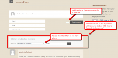
See attached. On my website, when the Subscription message is tapped, a subscribe box opens up, but only one option is visible saying "new follow-up comments". The only way to see the second option is to tap again within the subscribe field. Most users won't know they're supposed to do that and will instead click the signup button on the right, not knowing there is a second subscription option.
So, is there a way to have both subscribe options visible in a dropdown when someone first opens the subscribe box?
I also notice that the envelope icon is missing at the top left. Is there some way to add that as well?
Hi @langelliott,
is there a way to have both subscribe options visible in a dropdown when someone first opens the subscribe box?
We couldn't add the multiple attributes to select box as this will allow select multiple options at once.
I also notice that the envelope icon is missing at the top left. Is there some way to add that as well?
Please leave URL to allow us to check and provide a solution. If the icon displays, the users will guess to tap on subscription bar and select the subscription type they need.
URL:
https://musicofnature.com/spring-delights-2018/
It seems that there must be a solution to seeing the two subscribe choices at the same time. If not a dropdown, then perhaps as checkboxes? As it is now, I believe very few people will discover the second choice. Didn't you guys do it differently in the past?
Hi @langelliott,
I suggest you use the following CSS code, it will fix this div, so there will not be needed to click on "Click Here to Subscribe to Comments "
#wpcomm .wpdiscuz-subscribe-bar.wpdiscuz-hidden {
   display: block !important;
}
Then please navigate to Dashboard > Comments > Settings > Styling admin page, disable the "Do not load Font Awesome css lib" option to display the bell icon.
As it is now, I believe very few people will discover the second choice
wpDiscuz allows you to customize wpDiscuz as you like.
Doc for wpDiscuz Customization here:
https://wpdiscuz.com/docs/wpdiscuz-documentation/customization/custom-template-and-style/
Didn't you guys do it differently in the past?
I'm sorry, but we've never faced with this question before.
Thanks!


